
Designers gallery
Royal Mint Product Lead, Lee Jones, has selected some of his favourite medals from our collection which he feels exemplify the most important principles of medallic design.
Edward VI Coronation medal
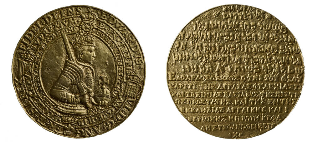
This medal is quite unusual in the way it looks. Wearing armour and with his sword leant against his shoulder, whilst holding the orb in his other hand, it is a reflection of his status as monarch and as a man of action. You can really pick up those things quite easily from the image and you have got to remember that we are now in an age where you can see the Queen anywhere, and you can see her in great detail. But in this period most people would only see the monarch on coins or medals.
The circles on the medal make it more reminiscent of graphic design as opposed to fine art and it is interesting that the sword doesn’t break through into the text, nor does the image of the monarch apart from near the base. That normally gives you an idea of foreground and background. If you had someone sitting in front of you behind a table, it gives you a sense of depth but, in this instance, you don’t get that it is just the text around him. It is very graphic and it is meant to be flat.
George VI Coronation medal
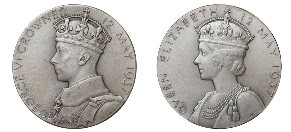
I chose this medal because of its execution. The way the artist, Percy Metcalfe, has depicted the subjects is very sensitive and you can almost believe their faces will turn around. The toning of this medal helps the portraits stand out and the way he has broken the crown into the inscription gives the piece a sense of depth. He has also created a unique type face, which is particularly evident in the word QUEEN. It is formal, rigid and very modern. It still even looks quite modern today because he has pared everything back. Modernism is all about paring something back rather than embellishment. That is why I chose this piece. It is very of its time, but will always look fresh because it is so well executed, and nor has he felt the need to fill every bit of that space. That is what people should be doing. They should be confident that they do not have to fill the whole medal. It is always a trip hazard that you think ‘I’ve got a bit more space, I’ll put that in there, I’ll put this in there.’ What is your narrative? What is your message? What is it that you are trying to get across? Be quite brutal with yourself.
Elizabeth II Silver Jubilee medal
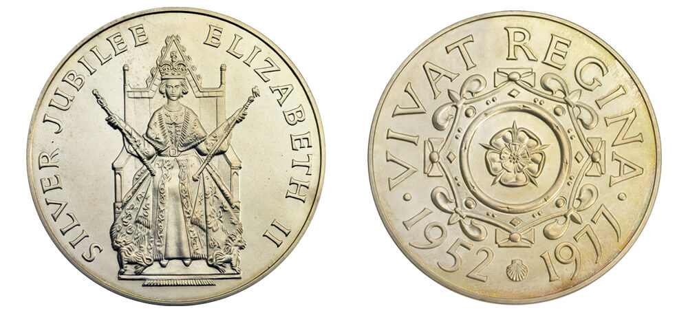
In the 1970s you start to see icons get a bit bigger, a bit bolder and a bit brasher. This almost looks like a brass rubbing of an idea. I don’t like it as much as I do Metcalfe’s work but it screams of it’s time - bold and brash. But in the 70s that is what was going on; think of the costume jewellery that people would be wearing. The reverse could be handled a little more delicately for my liking but there’s something about it. It harks back to the seals of Queen Victoria and what you would expect in the formality of an image of the Queen. In the 70s we were still very much looking up at the Queen, and we still do now, but almost looking parallel to her because we have so much access. Depicting her as she might appear on a Great Seal, enthroned and holding the orb and sceptre, is very formal. It is unnatural and that is what is brilliant about pomp and ceremony. It is so unnatural. It is a living language being enacted in front of you.
The Queen's Gold Medal for Poetry
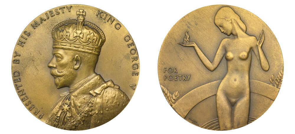
Dulac, the artist who produced this piece, was an illustrator of some note but the lightness and the balance that he has achieved on this medal is fantastic. I’ve looked long and hard at the model for this and there is very little on there, but he still manages to convey this human form. The delicacy of it and again there is very little on there. There is the figure of a woman, truth, rising naked from the well of inspiration and she is naked as truth has nothing to hide. There is a visually driven story to it that gives you a depth of meaning. A good coin or medal design should always enable you to go back and look at it again, just like you can pick up a variety of flavours from a really good meal. Overall, it is a wonderful piece.
William McMillan, British Empire Exhibition medal
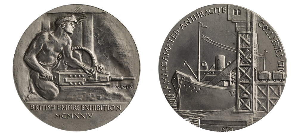
This is an exercise in medallic art. It’s very European looking, almost Russian in its appearance. It looks like it has been modelled in clay, the design has texture to it from the work of the hands. And we all like to see something that is not divorced from the human touch. That is one way to read the medal in itself. Someone has made it and it hasn’t been contrived by a machine. So when people are designing their medals they need not think just about paper and pen or computer. There are some designers who prefer to work in clay first but you can see the handprints in them which gives them the personal touch and makes them a bit more rugged. It suits the subject matter in this case.
The man working at the coal face says a lot about what the artist thinks. And how the artist believes this work is carried out. It’s an interesting study of the human form and about that worker. Strong, resolute and hardworking. You also have where it is coming from and where it is going to which gives it a nice little narrative. It is also interesting thinking about how the obverse and the reverse relate to one another. You cannot just have one design on one side and one design on the other. They should marry, they should not be totally divorced from each other. The reverse is a competent model but I do not think it is all that interesting as they knew they had to depict a ship being loaded with anthracite and there it is. It’s like starting a sentence in one language and ending it in another. In this instance the two sides are very disjointed.
Percy Metcalfe, British Empire Exhibition medal
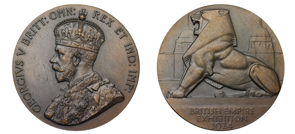
I think this is where everybody who starts to look at medals will come across Percy Metcalfe. He was an astounding artist. Never afraid to do something bold and brave. Look here, we have got a very good portrait on the one side that is following in the footsteps of the earlier example but then we get to the lion and it is Metcalfe in full force. The way he has made everything very angular and strong. He has gone for a triangular composition meaning it is very tight at the top of the lion's head and it spreads out towards the bottom. The base is where you would expect it to be and it makes everything feel that much more heavy. The lion is heavily stylised, the exhibition centre is in the background, but it is so delicately created and that gives you the sense of what they call atmospheric perspective. Look into the distance and things seem like they have a haze over them. That is because they have an atmosphere between us and them. He has managed to convey that in metal. There are all these subtle things we take for granted but he has managed to do them quite well. The lion captures the essence of what it is supposed to be. Showing a strong Britain, unafraid or abashed in any way.
Furens Gallia, Aux Armes medal, 1907
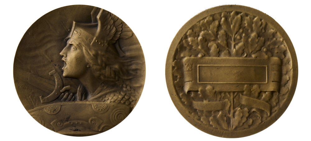
I would urge anybody to look at French medals and this is a prime example of its type. It is emotive, you can imagine an Opera set to this. There is a lot of delicate modelling in the background that I think people should take into account when they are thinking of medals. There’s a sense of movement in this as well. Just a few lines behind her seem to convey that sense of moving forward. Anybody familiar with cartoons will be aware of the little lines they put behind people to make them look faster. This is like that but done with some style. The trick of leaving a lot of plain area has been used to make you feel like she is going in this direction. There is often an urge to centralise things when you are working within a circle but it is not necessarily the best way to go. Designing for a circle is a pain in the neck because you can not use your golden ratios to do it without breaking the circle. I never start a design in a circle. I just start on a bare page and then put circles around things to find which is the composition I find more exciting. Do not think about the medal as 2D cut out shapes. Depict the three dimensionality of it all and do not restrict yourself. If you are unable to do it we probably will be able to get someone to model it.
Emile Monier, Bronze medals of Africa
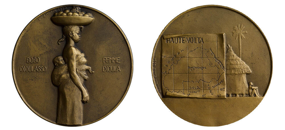
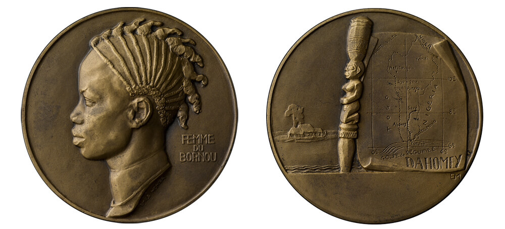
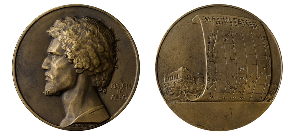
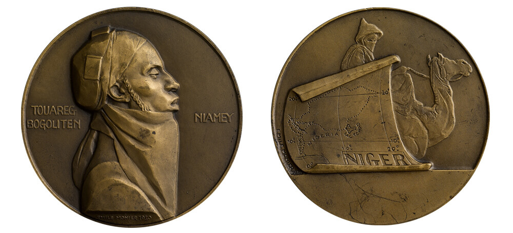
This is a series of medals, almost a series of medallic studies. They are marvellous and the weird departure of styling is like the artist could not help but go cubist every now and again. That is the beauty of art medals, you have got a certain amount of freedom. The sparseness of the designs really helps. Again, I think this was probably modelled up in clay and finished in plaster judging by the itch to go cubist. That happens with plaster quite a lot. Plaster is quite harsh and you can drag planes into it. When you are using low relief you want to capture light wherever you can. So sharp edges and changes of direction are always going to give you that. It gives you this diamond faceted style and that is why it has been used here. The reverses are also quite good. I always feel like sometimes they are an afterthought but here the idea is solid and each depicts a map of where you are expecting to be and a little characteristic next to it. The money is all in those portraits though. They are lovely the way they have been produced, almost as if the reverse is the title and the portrait is the art. The artist knows which side is going to be presented.
Robert Elderton, Saint of St Pancras medal
With coins you have unwritten rules about what goes on which side but with medals there is no such distinction. In this medal by Bob Elderton both sides are as strong as each other. You have got a wonderful portrait then you have a story being told on the other side. If I was personally making a medal I would want both sides to be as strong as each other, which increases the workload, but they are a tactile thing. They are meant to be picked up and that is where I’m a bit judgemental really about the other ones we were talking about. When we are talking about art medals it is like opening a book. The jacket can be creative with illustrations but then open it up and it has got to be a good story inside and that is what I would encourage people to think about when they produce their designs. Both sides should relate to each other and do not feel the need to fit all your story on one side - make sure you use both. It forces you to interact with the art rather than just observe.
Ewa Olszewska-Borys, In Memory of Joseph Conrad
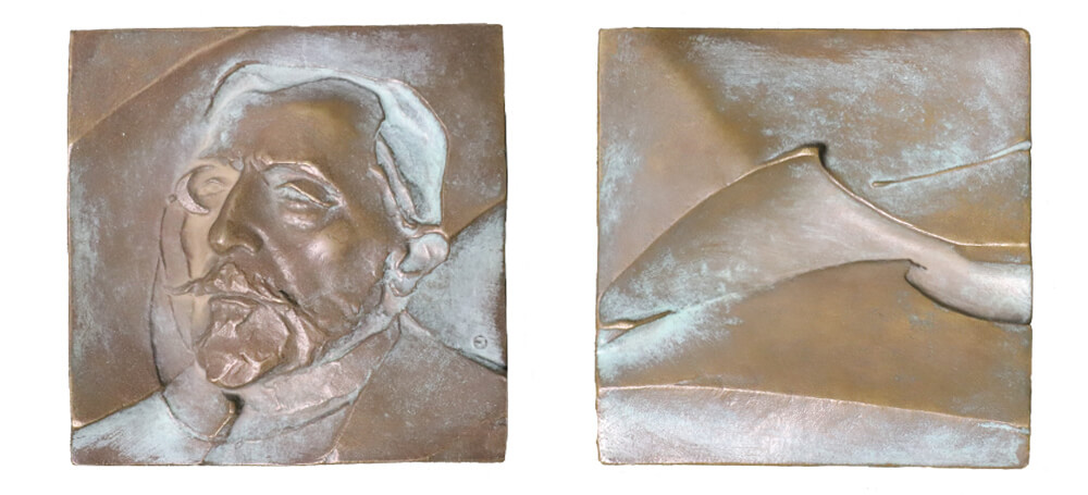
There is a lot going on in this medal of Joseph Conrad. The artist, Ewa Olszewska-Borys, plays with the notion of where the canvas is, parts of the portrait dipping into or rising above it. And why is that interesting? Well, you do not see that often and it gives a real sense of depth. Her touch is very light, there is not a lot of modelling in there. You really have to be good at your game to pull this off and you almost have to be able to do it in full detail before you can deconstruct it. She has learnt all the skills and then broken the rules. The texture and the brevity of the marks that she has used to make up a face are incredible and make for a really dramatic piece. It’s probably nearly two hours of making sure she has got the right forms in there but behind that two hours is 200 hours of studying. One of the things I see too much of is people trying to cram the surface of a medal. Ultimately, what are you trying to say? If you can not pare it down and say it eloquently then I suggest you go back to the drawing board and have another go. It sounds harsh but strip it back, do it again and then strip it back, because you learn more about your subject from that exercise rather than cramming in every detail of the subject. If you are asked for a 1000 word essay and present 10,000 you are not going to do very well.